Chapter 2 Visualizing two variables
In this chapter, you will learn techniques for exploring bivariate relationships.
2.1 Scatterplots
Scatterplots are the most common and effective tools for visualizing the relationship between two numeric variables.
The ncbirths dataset is a random sample of 1,000 cases taken from a larger dataset collected in 2004. Each case describes the birth of a single child born in North Carolina, along with various characteristics of the child (e.g. birth weight, length of gestation, etc.), the child’s mother (e.g. age, weight gained during pregnancy, smoking habits, etc.) and the child’s father (e.g. age). You can view the help file for these data by running ?ncbirths in the console.
library(openintro)
DT::datatable(ncbirths)
Exercise
Using the ncbirths dataset, make a scatterplot using ggplot() to illustrate how the birth weight of these babies varies according to the number of weeks of gestation.
# Scatterplot of weight vs. weeks
library(ggplot2)
ggplot(data = ncbirths, aes(y = weight, x = weeks)) +
  geom_point(alpha = 0.2) +
  theme_bw()
Warning: Removed 2 rows containing missing values (geom_point).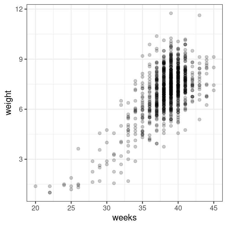
2.2 Boxplots as discretized/conditioned scatterplots
If it is helpful, you can think of boxplots as scatterplots for which the variable on the x-axis has been discretized.
The cut() function takes two arguments: the continuous variable you want to discretize and the number of breaks that you want to make in that continuous variable in order to discretize it.
Exercise
Using the ncbirths dataset again, make a boxplot illustrating how the birth weight of these babies varies according to the number of weeks of gestation. This time, use the cut() function to discretize the x-variable into six intervals (i.e. five breaks).
# Boxplot of weight vs. weeks
ggplot(data = ncbirths,
       aes(x = cut(weeks, breaks = 5), y = weight)) +
       geom_boxplot() +
       theme_bw()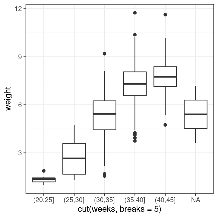
2.3 Creating scatterplots
Creating scatterplots is simple and they are so useful that is it worthwhile to expose yourself to many examples. Over time, you will gain familiarity with the types of patterns that you see. You will begin to recognize how scatterplots can reveal the nature of the relationship between two variables.
In this exercise, and throughout this chapter, we will be using several datasets listed below. These data are available through the openintro package. Briefly:
The
mammalsdataset contains information about 39 different species of mammals, including their body weight, brain weight, gestation time, and a few other variables.The
mlbbat10dataset contains batting statistics for 1,199 Major League Baseball players during the 2010 season.The
bdimsdataset contains body girth and skeletal diameter measurements for 507 physically active individuals.The
smokingdataset contains information on the smoking habits of 1,691 citizens of the United Kingdom.
To see more thorough documentation, use the ? or help() functions.
Exercise
- Using the
mammalsdataset, create a scatterplot illustrating how the brain weight of a mammal varies as a function of its body weight.
library(openintro)
# Mammals scatterplot
ggplot(data = mammals, aes(y = brain_wt, x = body_wt)) +
  geom_point() +
  theme_bw() +
  labs(x = "Body Weight (kg)", y = "Brain weight (kg)")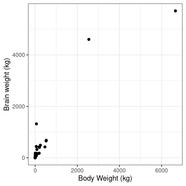
- Using the
mlbbat10dataset, create a scatterplot illustrating how the slugging percentage (slg) of a player varies as a function of his on-base percentage (obp).
# Baseball player scatterplot
p1 <- ggplot(data = mlbbat10, aes(y = slg, x = obp)) +
  geom_point(alpha = 0.10) +
  theme_bw() +
  labs(y = "Slugging percentage (TB/AB)", x = "On base percentage" )
p1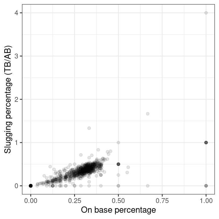
- Using the
bdimsdataset, create a scatterplot illustrating how a person’s weight varies as a function of their height. Use color to separate by sex, which you’ll need to coerce to a factor withfactor().
# Body dimensions scatterplot
p3 <- ggplot(data = bdims, aes(y = wgt, x= hgt, color = factor(sex))) +
  geom_point() +
  theme_bw() +
  labs(y = "Weight (kg)", x = "Height (cm)")
p3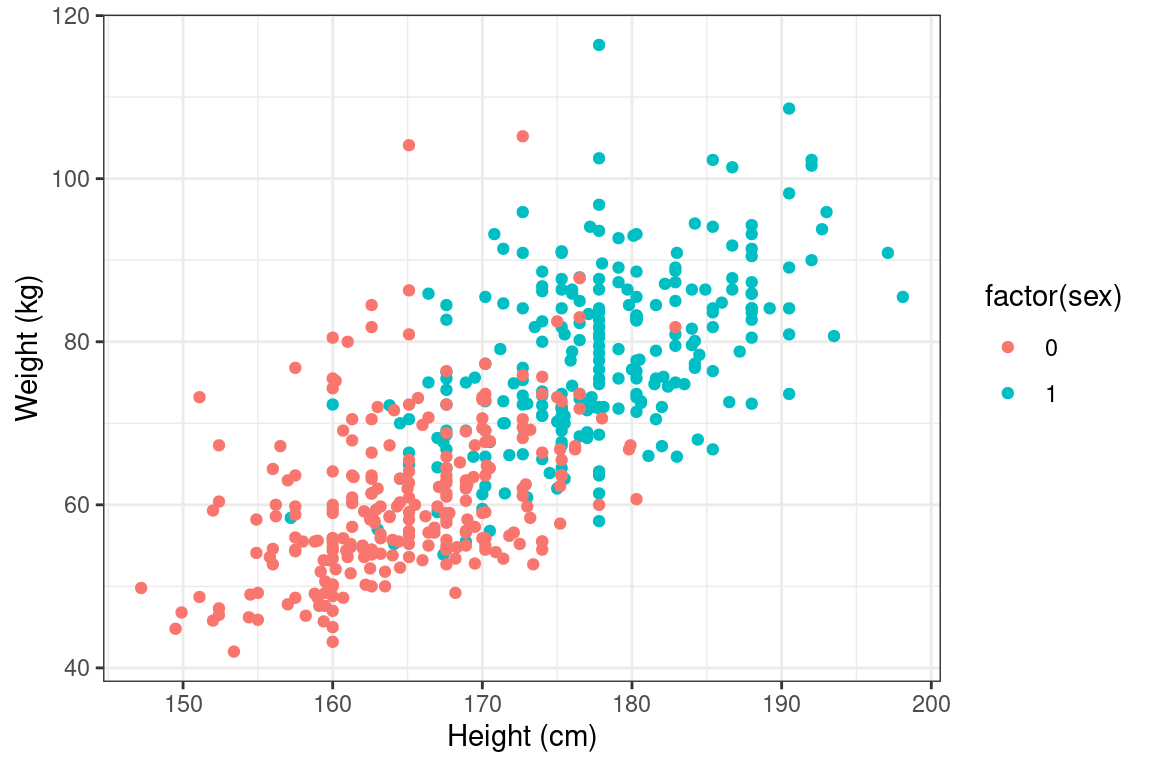
- Using the
smokingdataset, create a scatterplot illustrating how the amount that a person smokes on weekdays varies as a function of their age.
# Smoking scatterplot
ggplot(data = smoking, aes(y = amt_weekdays, x = age)) +
  geom_point(alpha = 0.2) +
  theme_bw() +
  labs(x = "Age", y = "Number of cigarettes smoked per day on weekdays")
Warning: Removed 1270 rows containing missing values (geom_point).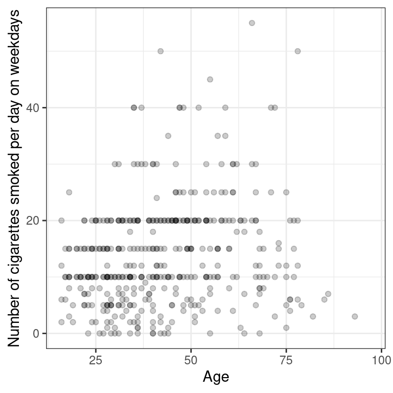
Characterizing scatterplots
Figure 2.1 shows the relationship between the poverty rates and high school graduation rates of counties in the United States.
Rows: 3083 Columns: 25
── Column specification ────────────────────────────────────────────────────────
Delimiter: ","
dbl (25): growth, FIPS, pop2010, pop2000, age_under_5, age_under_18, age_ove...

ℹ Use `spec()` to retrieve the full column specification for this data.
ℹ Specify the column types or set `show_col_types = FALSE` to quiet this message.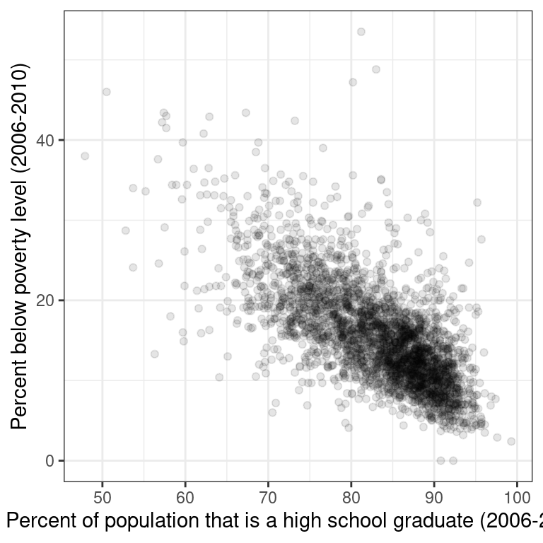
Figure 2.1: Poverty versus high school graduation rate
Describe the form, direction, and strength of this relationship.
Linear, positive, strong
Linear, negative, weak
Linear, negative, moderately strong
Non-linear, negative, strong
2.4 Transformations
The relationship between two variables may not be linear. In these cases we can sometimes see strange and even inscrutable patterns in a scatterplot of the data. Sometimes there really is no meaningful relationship between the two variables. Other times, a careful transformation of one or both of the variables can reveal a clear relationship.
Recall the bizarre pattern that you saw in the scatterplot between brain weight and body weight among mammals in a previous exercise. Can we use transformations to clarify this relationship?
ggplot2 provides several different mechanisms for viewing transformed relationships. The coord_trans() function transforms the coordinates of the plot. Alternatively, the scale_x_log10() and scale_y_log10() functions perform a base-10 log transformation of each axis. Note the differences in the appearance of the axes.
Exercise
The mammals dataset is available in your workspace.
- Use
coord_trans()to create a scatterplot showing how a mammal’s brain weight varies as a function of its body weight, where both the x and y axes are on a"log10"scale.
# Scatterplot with coord_trans()
ggplot(data = mammals, aes(y = brain_wt, x = body_wt)) +
  geom_point() +
  coord_trans(x = "log10", y = "log10") +
  theme_bw() +
  labs(x = "Total body weight of the mammal (in kg)",
       y = "Brain weight of the mammal (in kg)")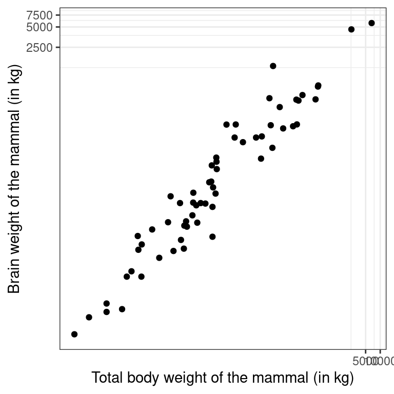
- Use
scale_x_log10()andscale_y_log10()to achieve the same effect but with different axis labels and grid lines.
# Scatterplot with scale_x_log10() and scale_y_log10()
p4 <- ggplot(data = mammals, aes(x = body_wt, y = brain_wt)) +
  geom_point() +
  scale_x_log10() +
  scale_y_log10() +
  theme_bw() +
  labs(x = "Total body weight of the mammal (in kg)",
       y = "Brain weight of the mammal (in kg)")
p4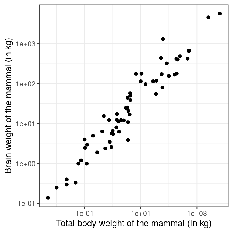
2.5 Identifying outliers
In Chapter ??, we will discuss how outliers can affect the results of a linear regression model and how we can deal with them. For now, it is enough to simply identify them and note how the relationship between two variables may change as a result of removing outliers.
Recall that in the baseball example earlier in the chapter, most of the points were clustered in the lower left corner of the plot, making it difficult to see the general pattern of the majority of the data. This difficulty was caused by a few outlying players whose on-base percentages (OBPs) were exceptionally high. These values are present in our dataset only because these players had very few batting opportunities.
Both OBP and SLG are known as rate statistics, since they measure the frequency of certain events (as opposed to their count). In order to compare these rates sensibly, it makes sense to include only players with a reasonable number of opportunities, so that these observed rates have the chance to approach their long-run frequencies.
In Major League Baseball, batters qualify for the batting title only if they have 3.1 plate appearances per game. This translates into roughly 502 plate appearances in a 162-game season. The mlbbat10 dataset does not include plate appearances as a variable, but we can use at-bats (at_bat) – which constitute a subset of plate appearances – as a proxy.
Exercise
- Use
filter()to create a scatterplot forslgas a function ofobpamong players who had at least 200 at-bats.
library(dplyr)
# Scatterplot of slg vs. obp
ntib <- mlbbat10 %>%
  filter(at_bat >= 200)
p2 <- ggplot(data = ntib, aes(y = slg, x = obp)) +
  geom_point() +
  theme_bw()
p2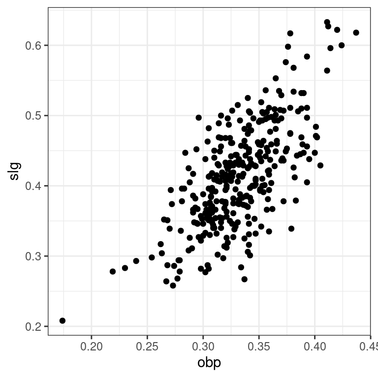
- Find the row of
mlbbat10corresponding to the one player with at least 200 at-bats whoseobpwas below 0.200.
# Identify the outlying player
mlbbat10 %>%
  filter(at_bat >=200, obp < 0.2)
# A tibble: 1 × 19
name team position game at_bat run hit double triple home_run rbi
<fct> <fct> <fct> <dbl> <dbl> <dbl> <dbl> <dbl> <dbl> <dbl> <dbl>
1 B Wood LAA 3B 81 226 20 33 2 0 4 14
# … with 8 more variables: total_base <dbl>, walk <dbl>, strike_out <dbl>,
# stolen_base <dbl>, caught_stealing <dbl>, obp <dbl>, slg <dbl>,
# bat_avg <dbl>