Chapter 3 Correlation
This chapter introduces correlation as a means of quantifying bivariate relationships.
Understanding correlation scale
In a scientific paper, three correlations are reported with the following values:
- -0.395
- 1.827
- 0.738
Choose the correct interpretation of these findings.
- is invalid.
- is invalid.
- is invalid.
Understanding correlation sign
In a scientific paper, three correlations are reported with the following values:
- 0.582
- 0.134
- -0.795
Which of these values represents the strongest correlation?
Possible Answers
0.582
0.134
-0.795
Can’t tell!
3.1 Computing correlation
The cor(x, y) function will compute the Pearson product-moment correlation between variables, x and y. Since this quantity is symmetric with respect to x and y, it doesn’t matter in which order you put the variables.
At the same time, the cor() function is very conservative when it encounters missing data (e.g. NAs). The use argument allows you to override the default behavior of returning NA whenever any of the values encountered is NA. Setting the use argument to "pairwise.complete.obs" allows cor() to compute the correlation coefficient for those observations where the values of x and y are both not missing.
Exercise
- Use
cor()to compute the correlation between the birthweight of babies in thencbirthsdataset and their mother’s age. There is no missing data in either variable.
library(openintro)
DT::datatable(ncbirths)
# Compute correlation
ncbirths %>%
summarize(N = n(), r = cor(weight, mage))# A tibble: 1 × 2
N r
<int> <dbl>
1 1000 0.0551- Compute the correlation between the birthweight and the number of weeks of gestation for all non-missing pairs.
# Compute correlation for all non-missing pairs
ncbirths %>%
  summarize(N = n(), r = cor(weight, weeks,
                             use = "pairwise.complete.obs"))
# A tibble: 1 × 2
N r
<int> <dbl>
1 1000 0.6703.2 Exploring Anscombe
In 1973, Francis Anscombe famously created four datasets with remarkably similar numerical properties, but obviously different graphic relationships. The Anscombe dataset contains the x and y coordinates for these four datasets, along with a grouping variable, set, that distinguishes the quartet.
It may be helpful to remind yourself of the graphic relationship by viewing the four scatterplots:
dat <- datasets::anscombe
Anscombe <- data.frame(
    set  = rep(1:4, each = 11),
    x = unlist(dat[ ,c(1:4)]),
    y = unlist(dat[ ,c(5:8)])
    )
rownames(Anscombe) <- NULL
head(Anscombe)
set x y
1 1 10 8.04
2 1 8 6.95
3 1 13 7.58
4 1 9 8.81
5 1 11 8.33
6 1 14 9.96#
ggplot(data = Anscombe, aes(x = x, y = y)) +
geom_point() +
facet_wrap(vars(set)) +
theme_bw()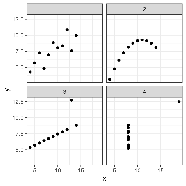
Exercise
For each of the four sets of data points in the Anscombe dataset, compute the following in the order specified. Don’t worry about naming any of the variables other than the first in your call to summarize().
Number of observations,
NMean of
xStandard deviation of
xMean of
yStandard deviation of
yCorrelation coefficient between
xandy
# Compute properties of Anscombe
Anscombe %>%
  group_by(set) %>%
  summarize(N = n(), mean(x), sd(x), mean(y), sd(y), cor(x, y))
# A tibble: 4 × 7
set N `mean(x)` `sd(x)` `mean(y)` `sd(y)` `cor(x, y)`
<int> <int> <dbl> <dbl> <dbl> <dbl> <dbl>
1 1 11 9 3.32 7.50 2.03 0.816
2 2 11 9 3.32 7.50 2.03 0.816
3 3 11 9 3.32 7.5 2.03 0.816
4 4 11 9 3.32 7.50 2.03 0.817Perception of correlation
Recall Figure 2.1 which displays the poverty rate of counties in the United States and the high school graduation rate in those counties from the previous chapter. Which of the following values is the correct correlation between poverty rate and high school graduation rate?
- -0.861
- -0.681
- -0.186
- 0.186
- 0.681
- 0.861
library(openintro)
cc %>%
  summarize(r = cor(poverty, hs_grad)) %>%
  round(3)
# A tibble: 1 × 1
r
<dbl>
1 -0.685Perception of correlation (2)
Estimating the value of the correlation coefficient between two quantities from their scatterplot can be tricky. Statisticians have shown that people’s perception of the strength of these relationships can be influenced by design choices like the x and y scales.
Nevertheless, with some practice your perception of correlation will improve. Study the four scatterplots in Figure 3.1, each of which you’ve seen in a previous exercise.
library(gridExtra)
grid.arrange(p1, p2, p3, p4)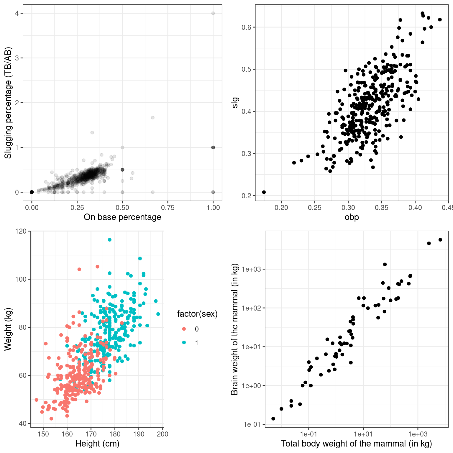
Figure 3.1: Four scatterplots
Jot down your best estimate of the value of the correlation coefficient between each pair of variables. Then, compare these values to the actual values you compute in this exercise.
Exercise
Each graph in the plotting window corresponds to an instruction below. Compute the correlation between…
obpandslgfor all players in themlbbat10dataset.
# Correlation for all baseball players
mlbbat10 %>%
  summarize(r = cor(obp, slg))
# A tibble: 1 × 1
r
<dbl>
1 0.815obpandslgfor all players in themlbbat10dataset with at least 200 at-bats.
# Correlation for all players with at least 200 ABs
mlbbat10 %>%
  filter(at_bat >= 200) %>%
  summarize(r = cor(obp, slg))
# A tibble: 1 × 1
r
<dbl>
1 0.686- Height and weight for each sex in the
bdimsdataset.
# Correlation of body dimensions
bdims %>%
  group_by(sex) %>%
  summarize(N = n(), r = cor(hgt, wgt))
# A tibble: 2 × 3
sex N r
<int> <int> <dbl>
1 0 260 0.431
2 1 247 0.535- Body weight and brain weight for all species of mammals. Alongside this computation, compute the correlation between the same two quantities after taking their natural logarithms.
# Correlation among mammals, with and without log
mammals %>%
  summarize(N = n(),
            r = cor(brain_wt, body_wt),
            r_log = cor(log(brain_wt), log(body_wt)))
# A tibble: 1 × 3
N r r_log
<int> <dbl> <dbl>
1 62 0.934 0.960Interpreting correlation in context
Recall Figure 2.1 where you previously determined the value of the correlation coefficient between the poverty rate of counties in the United States and the high school graduation rate in those counties was -0.681. Choose the correct interpretation of this value.
People who graduate from high school are less likely to be poor.
Counties with lower high school graduation rates are likely to have lower poverty rates.
Counties with lower high school graduation rates are likely to have higher poverty rates.
Because the correlation is negative, there is no relationship between poverty rates and high school graduate rates.
Having a higher percentage of high school graduates in a county results in that county having lower poverty rates.
Correlation and causation
In the San Francisco Bay Area from 1960-1967, the correlation between the birthweight of 1,236 babies and the length of their gestational period was 0.408. Which of the following conclusions is not a valid statistical interpretation of these results.
We observed that babies with longer gestational periods tended to be heavier at birth.
It may be that a longer gestational period contributes to a heavier birthweight among babies, but a randomized, controlled experiment is needed to confirm this observation.
Staying in the womb longer causes babies to be heavier when they are born.
These data suggest that babies with longer gestational periods tend to be heavier at birth, but there are many potential confounding factors that were not taken into account.
3.3 Spurious correlation in random data
Statisticians must always be skeptical of potentially spurious correlations. Human beings are very good at seeing patterns in data, sometimes when the patterns themselves are actually just random noise. To illustrate how easy it can be to fall into this trap, we will look for patterns in truly random data.
The noise dataset contains 20 sets of x and y variables drawn at random from a standard normal distribution. Each set, denoted as z, has 50 observations of x, y pairs. Do you see any pairs of variables that might be meaningfully correlated? Are all of the correlation coefficients close to zero?
# Create noise
set.seed(9)
noise <- data.frame(x = rnorm(1000), y = rnorm(1000), z = rep(1:20, 50))- Create a faceted scatterplot that shows the relationship between each of the 20 sets of pairs of random variables
xandy. You will need thefacet_wrap()function for this.
# Create faceted scatterplot
ggplot(dat = noise, aes(x= x, y = y)) +
  geom_point() +
  facet_wrap(vars(z)) +
  theme_bw()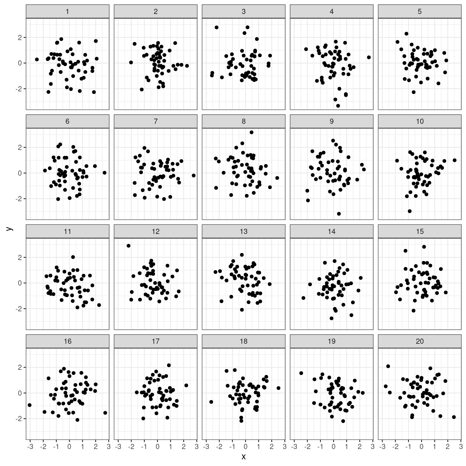
- Compute the actual correlation between each of the 20 sets of pairs of
xandy.
# Compute correlations for each dataset
noise_summary <- noise %>%
  group_by(z) %>%
  summarize(N = n(), spurious_cor = cor(x, y))
noise_summary
# A tibble: 20 × 3
z N spurious_cor
<int> <int> <dbl>
1 1 50 -0.104
2 2 50 -0.0704
3 3 50 0.0185
4 4 50 -0.161
5 5 50 -0.131
6 6 50 -0.0356
7 7 50 -0.00713
8 8 50 -0.141
9 9 50 -0.0564
10 10 50 0.216
11 11 50 -0.246
12 12 50 -0.175
13 13 50 -0.223
14 14 50 0.0175
15 15 50 -0.000720
16 16 50 0.149
17 17 50 -0.0179
18 18 50 0.0839
19 19 50 -0.221
20 20 50 -0.0969 - Identify the datasets that show non-trivial correlation of greater than 0.2 in absolute value.
# Isolate sets with correlations above 0.2 in absolute strength
noise_summary %>%
  filter(abs(spurious_cor) >= 0.2)
# A tibble: 4 × 3
z N spurious_cor
<int> <int> <dbl>
1 10 50 0.216
2 11 50 -0.246
3 13 50 -0.223
4 19 50 -0.221